

Get 15-day free trial
Featured in Gartner's
Magic Quadrant for
CRM CEC 2023
#1 in user satisfaction
within the Help Desk
category for 2024
Ranked as the #1
Help Desk software
of 2024
Over 100,000 businesses
around the world trust Zoho Desk to elevate their customer service
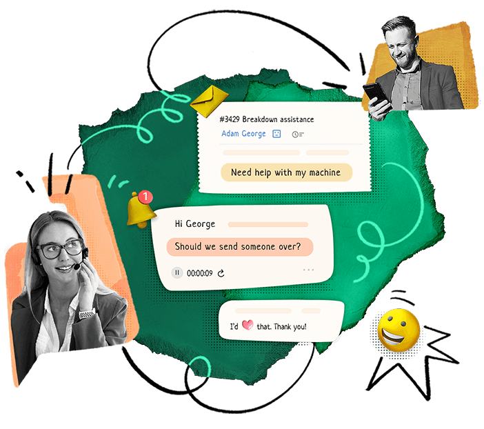
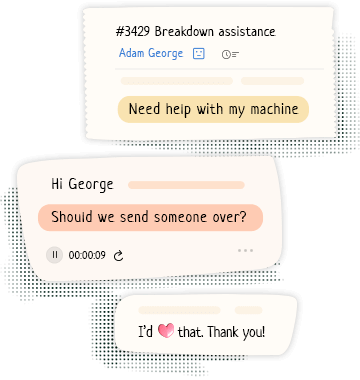
AI-powered customer service


Happier customers
Thrive on customer happiness with Zoho Desk! Zoho Desk helps you be more accessible to your customers, provide them with quick and accurate resolutions, and make doing business with you convenient.


Empowered agents
Ace customer service at every stage of the customer journey! Zoho Desk empowers agents with powerful tools and helpful context, so they remain productive, confident, and organized.


Healthier businesses
Build long lasting customer experiences for a stronger, more sustainable, and healthier business. Zoho Desk helps you keep track of actionable customer service metrics, understand customer needs better, and consistently deliver value.


Great customer service for
every business size
Zoho's broader objective is to make quality tech available, accessible, and affordable to all. In doing so, Zoho Desk meets the needs of organizations of all sizes.

Startups
Make an essential early
investment to develop and strengthen
your customer relationships.


Enterprises
Provide elevated service experiences to
all your stakeholders with our powerful
CX stack.
Integrates with apps
you use daily
Zoho Desk integrates with over 200 of the most popular third-party app extensions, and more than 45 native apps.
Extend your desk’scapabilities
Fully Mobile
Help customers even when you're away from your desk. With Zoho Desk's mobile apps for Android and iOS, you can close tickets on the go and get a bird's eye view of your customer service health at a glance.
Try Zoho Desk app Try Radar app

Feedonomics has more than 400 users leveraging all the available features to their fullest extent.
Mercedes-Benz improved customer satisfaction across their whole dealership network.
I believe that what we've achieved in collaboration with the Zoho Desk team has made a huge impact on how efficiently we can resolve complex requests for our clients, and it has been a major improvement for our customer experience.
Jason NicholVice President,
Product
We analysed other products on the market but Zoho Desk blended into our organization structure better than anything else.
Swaroop NaikSenior Manager,
Software Development
Why choose Zoho Desk?

- 50% faster implementation than most customer service software
- Dedicated training program with shallow learning curve
- Customizable workspace that works across any industry, brand, and department
- Hassle-free migration with the help of our account executives
- No hidden costs, no forced contracts, and no lock-ins
- Compliant with data protection laws, such as GDPR, HIPAA, and CCPA
Sensational software for a
sensible price
- No credit card required.
- No software to download.